Highland Park homes sell best when curb appeal and interior presentation speak to a wide range of buyer preferences. Paint color choices shape first impressions and influence perceived value. The following guidance focuses on timeless hues and practical strategies for Highland Park, TX properties to appeal to prospective buyers and enhance resale potential.
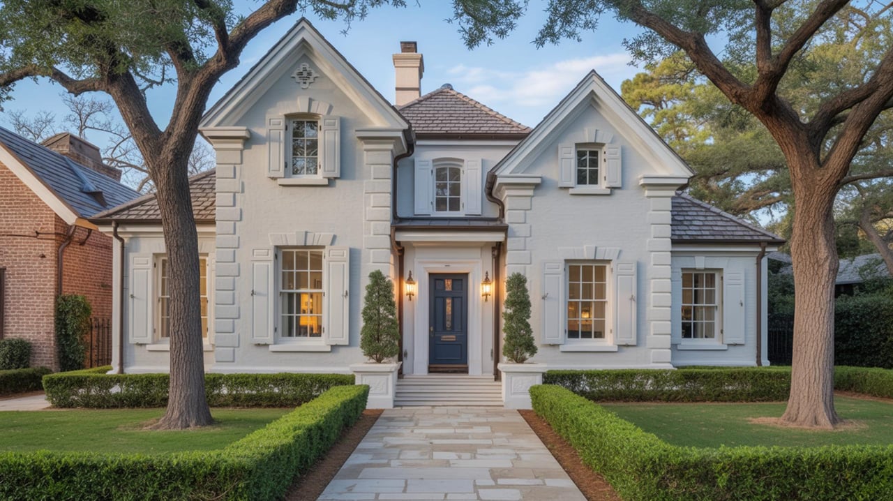
Classic Neutral Exteriors
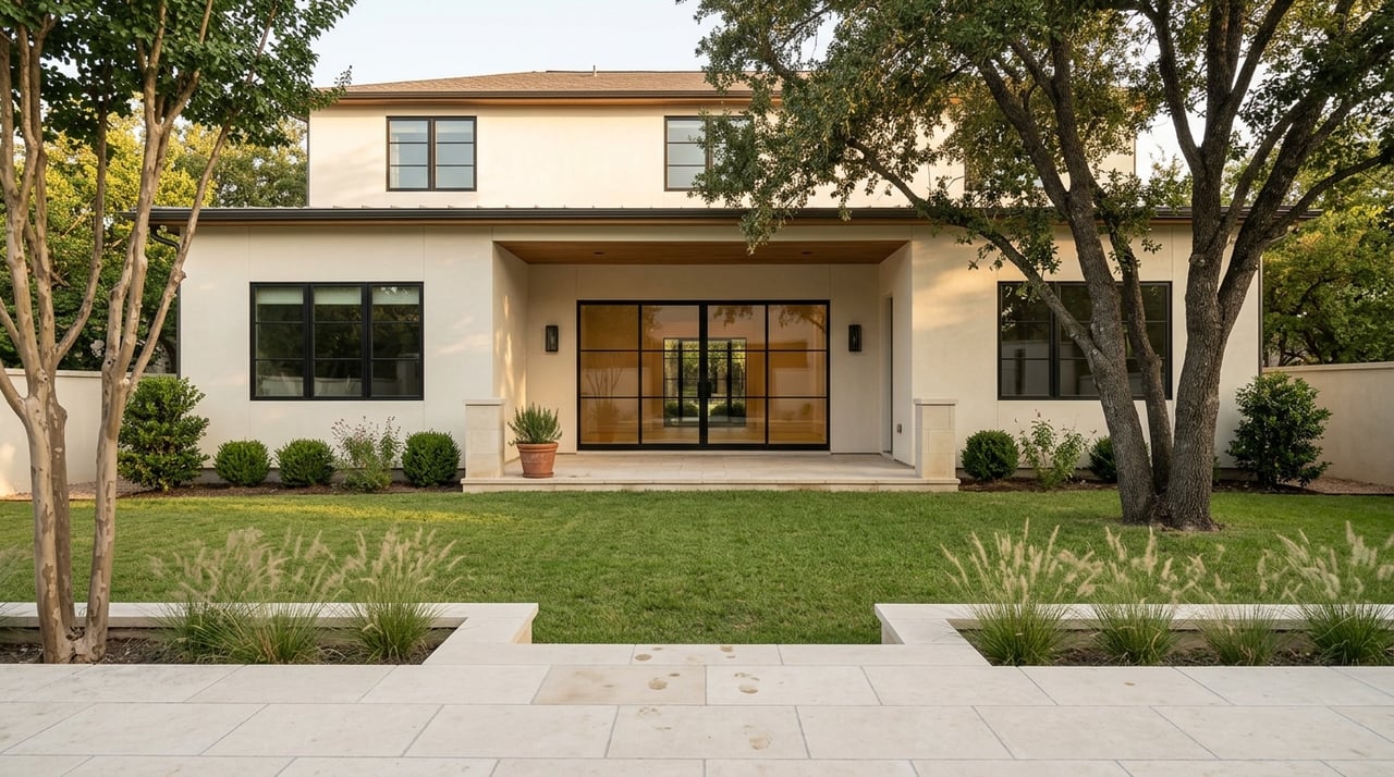
Neutral exterior palettes create an inviting streetscape and complement traditional Highland Park architecture. Warm greige tones pair well with brick facades and mature landscaping common in the area. Crisp white trim highlights architectural details and contrasts with darker rooflines. When stucco is present, a soft sand tone reads elegant under Texas sun. For wood siding, a muted taupe preserves character while appearing well maintained. Test paint on multiple elevations and view samples at different times of day to confirm appearance under natural light.
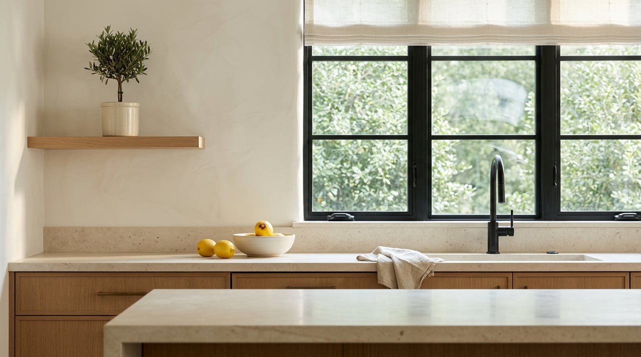
Sophisticated Interior Whites
Interior white walls provide a clean backdrop that accentuates moldings and built ins typical of Highland Park homes. Opt for whites with a slight warmth to avoid a sterile effect under incandescent or LED lighting. Use a satin finish in living spaces for subtle sheen and easier cleaning. Kitchens benefit from a cooler undertone to make cabinetry and countertops pop. When staging for showings, white walls allow furniture and artwork to stand out without competing colors.
Soft Grays For Living Spaces
Soft gray walls create a refined atmosphere that appeals to many buyers. Choose mid tone grays with subtle warm undertones to maintain a welcoming feel. Grays work especially well in formal dining rooms and family rooms where neutral elegance supports a variety of décor styles. Combine gray walls with natural wood floors to keep rooms grounded. Include sample swatches near existing furnishings to check compatibility before committing to a full repaint.
Muted Blues For Bedrooms
Muted blue tones lend a calming presence to bedrooms and studies. Lean toward powder blues or blue grays that are understated and versatile. These hues pair nicely with white trim and pale wood finishes found in many Highland Park interiors. Use matte finishes in sleeping areas to reduce reflection and promote a cozy mood. Consider two tone treatment with lighter blue on the ceiling to create depth without overwhelming the space.
Warm Accents For Entryways
Entryways benefit from warm accent colors that suggest hospitality while remaining tasteful. Deep caramel or soft terracotta can bring personality to a foyer without overpowering adjacent rooms. Keep the surrounding trim and adjacent walls neutral so the accent reads intentional. Accent finishes should be limited to key focal areas such as the front door surround or a single feature wall to preserve broad appeal among prospective buyers.
Kitchen Cabinet Colors That Endure
Cabinet color choices influence perceived kitchen value. Classic off white remains a strong choice for traditional Highland Park kitchens. For a slightly modern look that still reads timeless, consider a muted navy on lower cabinets paired with white uppers. Natural wood stains that highlight grain work well in craftsman influenced spaces. Finish hardware in satin nickel or aged bronze to complement the paint selection. Ensure cabinet samples are evaluated next to countertop materials to confirm harmony.
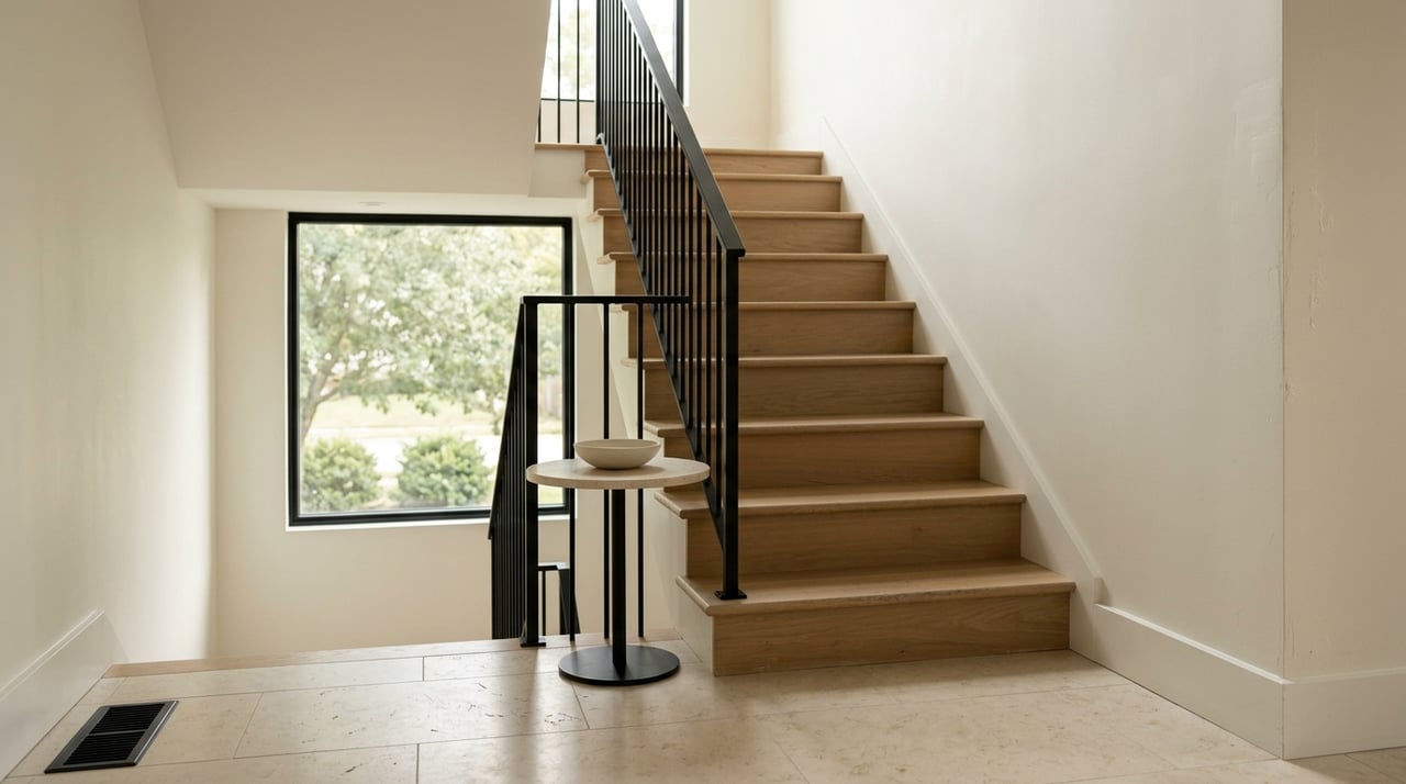
Trim And Millwork That Pops
Trim and millwork define room edges and ornate details in many Highland Park residences. Pure white trim creates crisp contrast against colored walls and highlights crown moldings and built ins. When existing trim shows wear, a fresh coat of high quality paint rejuvenates the space and communicates meticulous upkeep. For darker wall colors, slightly off white trim prevents high contrast glare while preserving definition. Use semi gloss for trim to resist scuffs and simplify touch ups.
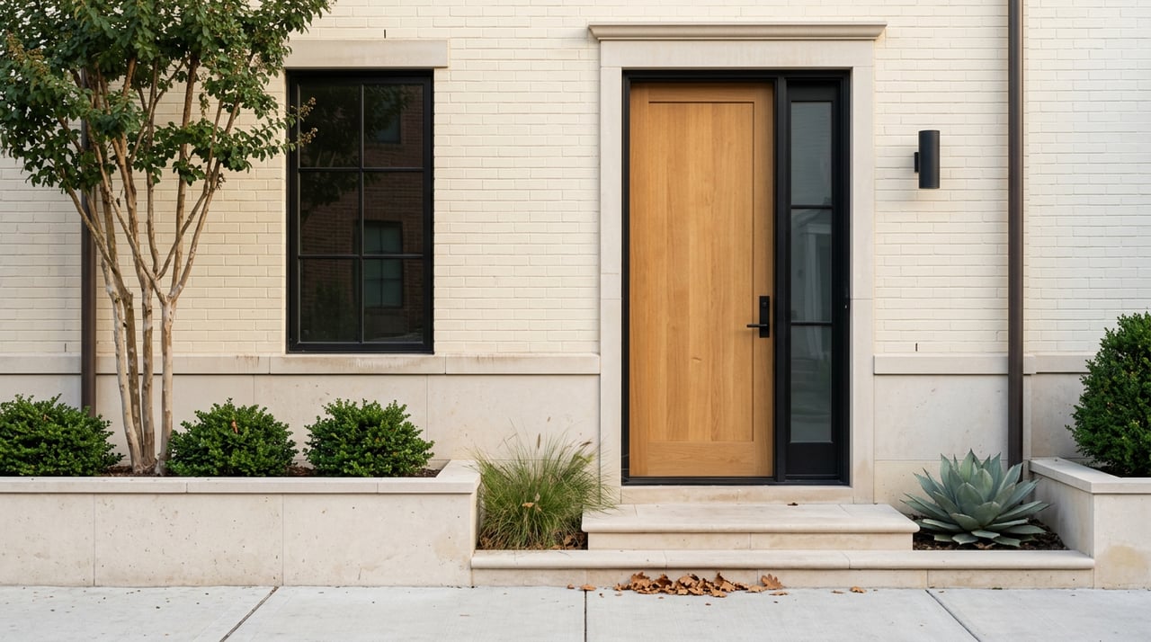
Exterior Door And Garage Color Choices
Front doors and garage doors are focal points for curb appeal. A deep charcoal or classic navy on a front door provides a statement without alienating buyers. For garage doors, a color that coordinates with siding avoids visual fragmentation on the facade. When the home has prominent brick, choose door colors that complement the brick undertone. Consider durable exterior paint formulas that withstand Texas heat and sun exposure to maintain color integrity through seasons.
Paint Quality And Application Tips
Investing in premium paint and professional application yields lasting results that reassure buyers. Higher grade paints deliver better coverage and color uniformity, reducing the need for multiple coats. Proper surface preparation prevents peeling and enhances adhesion on older siding and trim. When hiring painters, request references and verify experience with historic or high end homes to ensure attention to architectural details. Schedule painting during mild weather to allow adequate drying and curing time.
Staging Colors For Photos And Showings
Colors chosen for photography should translate well in both natural and artificial light. Soft, neutral interiors photograph consistently and allow digital listings to reflect accurate room dimensions and finishes. Avoid highly saturated hues in spaces that will be prominently featured online. For staged rooms, layer texture through rugs and throws rather than vivid wall colors to achieve visual interest. When listing images are taken, confirm white balance settings match the paint tones to prevent misleading representations.
H3 Practical Sample Testing Methods
Testing wall sections in multiple rooms helps predict final outcomes. Paint a panel in each space and observe the color at morning, midday, and evening light. Take photographs under the lighting used for online listings to ensure the photographed tone aligns with in person appearance. For exterior palettes, test small areas on each elevation to see how sun exposure and landscaping affect perception. Keep records of final paint codes to simplify touch ups and future maintenance.
H3 Coordination With Landscaping And Hardscapes
Exterior paint choices should relate to the home’s landscaping and hardscape materials. Warm earth tones harmonize with mature oaks and clay pavers commonly found in Highland Park yards. Cooler grays and blues can complement stone accents and contemporary metalwork. When planning front entry paint, step back to view the whole facade and adjacent homes to ensure a cohesive streetscape. Color continuity between porch trim and adjacent shutters enhances curb appeal and visual flow.
H3 Communication With Real Estate Agent
Real estate agent input helps align color choices with current buyer preferences in Highland Park. Agents familiar with local market trends can suggest palettes that resonate with active buyers. Sharing photographs and room function details enables the agent to advise on which spaces will have the greatest impact when repainted. Coordinating painting schedules with listing timelines ensures the home presents at peak condition for showings and open houses.
Timeless Paint Colors for Highland Park Homes That Sell
Choosing classic, neutral palettes like soft grays, warm greiges, and crisp whites can instantly elevate curb appeal and appeal to the broadest pool of buyers. In Highland Park, TX where discerning buyers expect polished, move-in-ready homes, the right color choices can shorten time on market and boost offers. For tailored color selections and staging strategies that complement your home's architecture, turn to local experts who know this market. Ready to maximize your home's appeal and value? Contact Cardoza Group, Inc today to schedule a consultation.